
Eliminate Printing Color Deviation, Restore True Image Presentation
In daily office work, lifestyle photography, and graphic design, many people encounter a common problem: images, posters, and photos that appear vibrant and layered on computer and mobile screens often look disappointing after printing. The prints may turn dull or yellowish overall, suffer from severely reduced saturation, lose bright vivid tones, and display distorted skin textures. In fact, this is not simply caused by poor printer quality. The core issue lies in print color reproduction. Understanding the underlying principles of color reproduction and mastering basic calibration methods can greatly improve print quality, achieving accurate on-paper results that match what you see on screen.
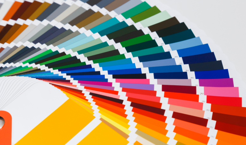
1. What is Print Color Reproduction?
Print color reproduction refers to the degree of consistency in color, brightness, layering, and color temperature between printed outputs and the original digital files, serving as a core criterion for evaluating print quality. It covers far more than simple color similarity, encompassing multiple dimensions including grayscale balance, color transition, detail retention, and uniform color temperature.
A higher color reproduction level enables printed works to closely match the original design and shooting effects with natural colors, smooth transitions, no color deviation or color banding. In contrast, prints with poor color reproduction suffer from color distortion, dull visuals, lost details and chaotic overall tones, which seriously undermine the texture of photos, the display effect of posters, and the presentation quality of design works.
2. Root Causes of Print Color Difference: Two Distinct Color Rendering Principles
Most print color deviation issues stem from the fundamental difference in color rendering principles between screen display and physical printing. This is an inherent, unavoidable gap and the core reason why color reproduction requires professional optimization.
Electronic screens (mobile phones, computers, and tablets) adopt the RGB additive color model. They produce colors through active backlight illumination, combining red, green, and blue light to generate a wide spectrum of hues. The more light layers are superimposed, the brighter the image becomes. This extensive color gamut supports high-saturation and high-brightness colors, which explains why on-screen visuals appear vivid and bright.
In contrast, physical printing applies the CMYK subtractive color model. Paper does not emit light. It forms colors by absorbing ambient light and reflecting residual wavelengths through cyan, magenta, yellow, and black inks. More layers of ink result in darker tones, and the overall printable gamut is significantly narrower than the RGB gamut of screens. Many bright, highly saturated on-screen colors fall beyond the reproducible range of printing inks. The printer can only approximate the closest match, which inevitably causes color deviation. Simply put, screens generate colors by light emission, while prints render colors by light reflection — creating an inherent visual difference between the two.